A lot of business websites look fine at first glance. Clean design, decent images, a few sections that feel “modern.” And then you watch what happens next: visitors land, scroll a bit, hesitate, and leave. No inquiry. No call. Nothing.
The problem usually isn’t that the website looks bad. It’s that it doesn’t guide anyone anywhere.
A high-converting website works differently. It’s built with intent, not decoration. Every section has a job. Every message pushes the visitor one step closer to understanding what the business does and why it matters.
The first layer is clarity. When someone lands on your site, they should immediately understand three things: what you do, who it’s for, and why they should care. If that’s not obvious in a few seconds, most users won’t “figure it out.” They’ll just leave.
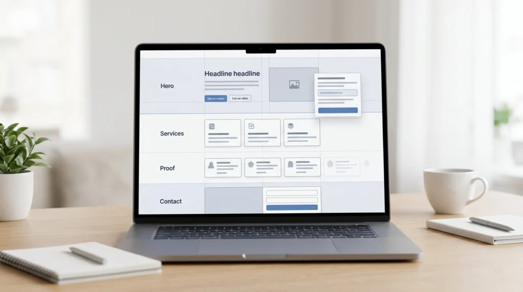
Next is structure. A converting website follows a natural flow. The homepage introduces the value. Service pages break it down. Proof builds confidence. Then the final step removes friction and makes it easy to take action. When this flow is missing, even strong businesses feel confusing online.
Design plays a quiet but powerful role here. Not flashy design, not overdesigned layouts, just intentional spacing, readable typography, and hierarchy that actually makes sense. People don’t consciously analyze design, but they absolutely feel when something is messy or hard to follow. And when it feels off, trust drops immediately.
Then comes messaging. This is where most websites try too hard. They use vague phrases, heavy marketing language, or overly clever lines that sound nice but don’t say anything useful. High-converting websites do the opposite. They speak clearly. They explain things in plain language. They focus on being understood, not admired.
Performance is another hidden factor. A slow website quietly kills conversions. Users don’t complain about it, they just don’t wait. Even small delays create doubt, and doubt is usually enough for someone to leave and never return.
Finally, there’s trust. This is the part that actually decides conversions. Testimonials, real work, recognizable signals, consistent branding, and a sense that the business is stable and real. Trust isn’t built with one element. It comes from everything working together without contradictions.
The mistake many businesses make is trying to “fix conversions” with one change, like a better button or a redesigned hero section. But conversion is not a single feature. It’s the result of everything working in alignment. Clarity, structure, design, messaging, performance, and trust all have to support each other.
When that happens, the website stops feeling like a static page and starts behaving like a system. One that quietly explains, reassures, and guides people toward action without needing to force anything.
That’s the difference between a website that exists and a website that actually works.